Client Stories
Where audacious ideas turn into real stories.
See how we deliver value and go above and beyond - straight from those we empower.
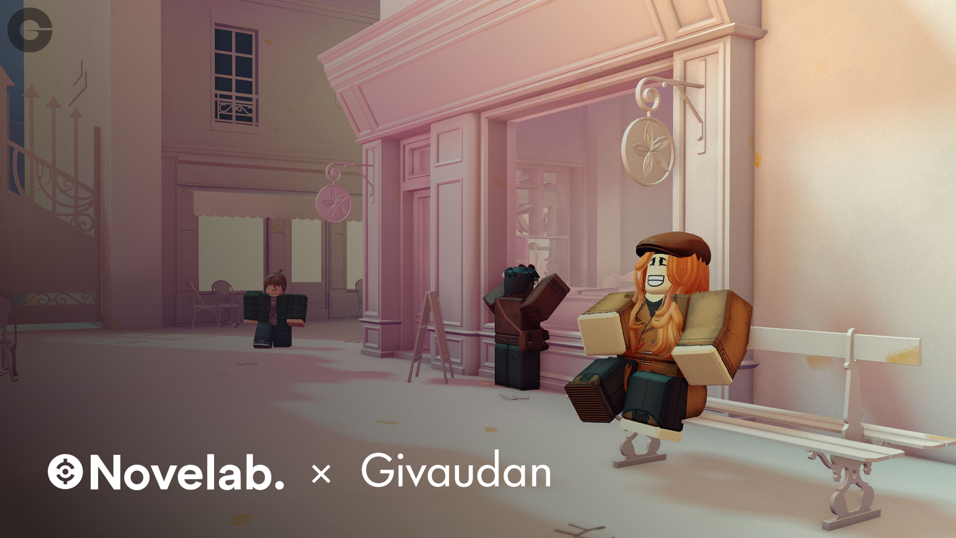 Guardians of Memories: an interactive experienceIn 2022, after experimenting with VR and fragrance, Givaudan turned to Web3 to digitize scent. A workshop with Digitalli sparked the idea of an immersive educational game.
 Marketing mastery: A-DERMA’s First Steps campaignDiscover A-DERMA's success with 'First Steps', a strategic marketing campaign, blending expert baby care with insightful maternity support..
 Pioneering cloud infrastructureAmaris Consulting, is at the forefront of a pivotal cloud infrastructure project with a leading Chilean bank.
 Digital excellence in insurance techDiscover how Amaris Consulting delivered digital excellence in insurance, optimizing customer journeys and enhancing service platforms, to a French banking leader.
 Transforming data management: a strategic leap forwardLearn how Amaris Consulting is upgrading a Chilean data center to a regional hub, enhancing data management for leading company.
 Livestreaming connectivity: bringing audiences closerExplore the transformation of healthcare events with secure livestreaming services, enhancing professional engagement and knowledge exchange.
 Streamlining access management to improve securityAmaris Consulting's expert strategies significantly improve security for railway networks, ensuring safe, reliable transportation.
 Revolutionizing online luxury automotive retailNovelab developoed an immersive virtual showroom experience to revolutionize a company's digital automotive retail capacities.
 Generative AI solutions for peak precision and efficiencyAmaris Consulting is in the advanced stages of developing customized generative AI solutions.
 Leveraging AI in healthcare to decode obesityAmaris Consulting leveraged its healthcare expertise to participate in an obesity research project.
 Oncology’s AI frontier: crafting survival prediction toolsAmaris Consulting, is harnessing its data analysis and artificial intelligence expertise to test new AI predictive modelling methods and apply them to extrapolate the long-term survival curves in oncology.
 The innovative role of digital twins in Swiss watchmakingA Swiss watchmaker, with Amaris Consulting's support, embraces digital twin tech, enhancing its production efficiency and upholding its heritage.
 Centralizing IT support to drive efficiencyThe strategic centralization of IT support transformed a global pet food giant's Southeast Asia operations.
 Elegance and exclusivity: a spectacular Revibe eventSeeking insight into crafting exclusive, high-end events? Read on to learn all about the exciting VIP and Press event organized by Revibe Events, a Mantu brand.
 Gloss and browse: creating a beauty d-commerce appLearn how Mantu brand LittleBig Connection developed a cutting-edge app for a global beauty giant.
 Modernizing retail stores through effective project managementDiscover how a Swiss watchmaker's strategic partnership with Amaris Consulting transformed their stores' payment solutions through effective project management.
 Becoming an intrapreneurship magnetFind out how Mantu brands supported Edenred in creating a thriving in-house intrapreneurship program.
 Building engagement through gamingDiscover how gaming in the workplace can transform team engagement and dynamics.
 Decoding carbon footprintsUncover the French government's new innovative approach to reducing its residents' carbon footprint.
 The blueprint for supply chain excellenceA leading cash-and-carry retailer engaged the specialized expertise of Valuement to optimize their supply chain.
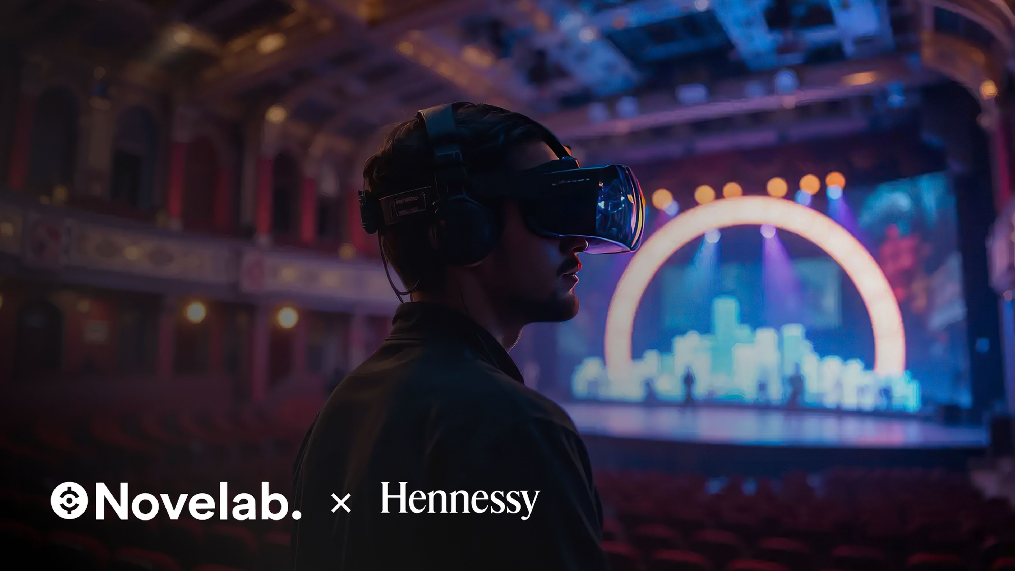 Art meets technology: Hennessy’s Very Special VR eventFind out how Novelab crafted a unique VR event to promote Hennessy's 2021 partnership with Les Twins.
 Unlocking the power of data-driven insights for athletesExplore how a global sporting goods retailer is using data to redefine the athletic experience.
 Banking beyond: the new metaverse frontierLearn about Mantu brand Novelab played a role in helping Banque Populaire Auvergne-Rhone-Alpes strategically tap into the metaverse's banking possibilities.
 Unlocking business efficiency with LittleBig ConnectionExplore how a Mantu brand supported Bouygues Telecom in customizing and streamlining processes to achieve high operational satisfaction and better efficiency.
 Battery-powered progress: steering toward sustainabilityExplore how a Mantu brand is facilitating Porsche Engineering's transition from traditional engine-focused design to cutting-edge battery-powered vehicles.
 Becoming a purpose-driven healthcare leaderDiscover how a Mantu brand supported Ramsay Santé in becoming a purpose-driven organization.
 Connecting to the EMEA market: the Sonos challengeSee how Sonos improved its online EMEA presence with the help of Mantu experts.
 Transforming cultural industries with technologyThe use of technology is transforming the visitor experience at museums and other cultural institutions.
 Tracking and Monitoring Gas Emission-based Data for a Greener SingaporeHow Mantu supports Faurecia with Singapore's clean air initiatives through tracking and monitoring
 Transforming Security and Upgrading Customer Satisfaction through UX DesignHow Mantu supports Securitas in improving protection outside it's clients' homes through UX Design
 Transforming and Implementing a Sales & Demonstration ToolHow Mantu supports a leading electronics group in transforming its sales and demonstration tool
 Completing a Global Migration ProjectHow Mantu supports the Foundation for High Horology in transitioning to Amazon Cloud Services to complete a global migration project


